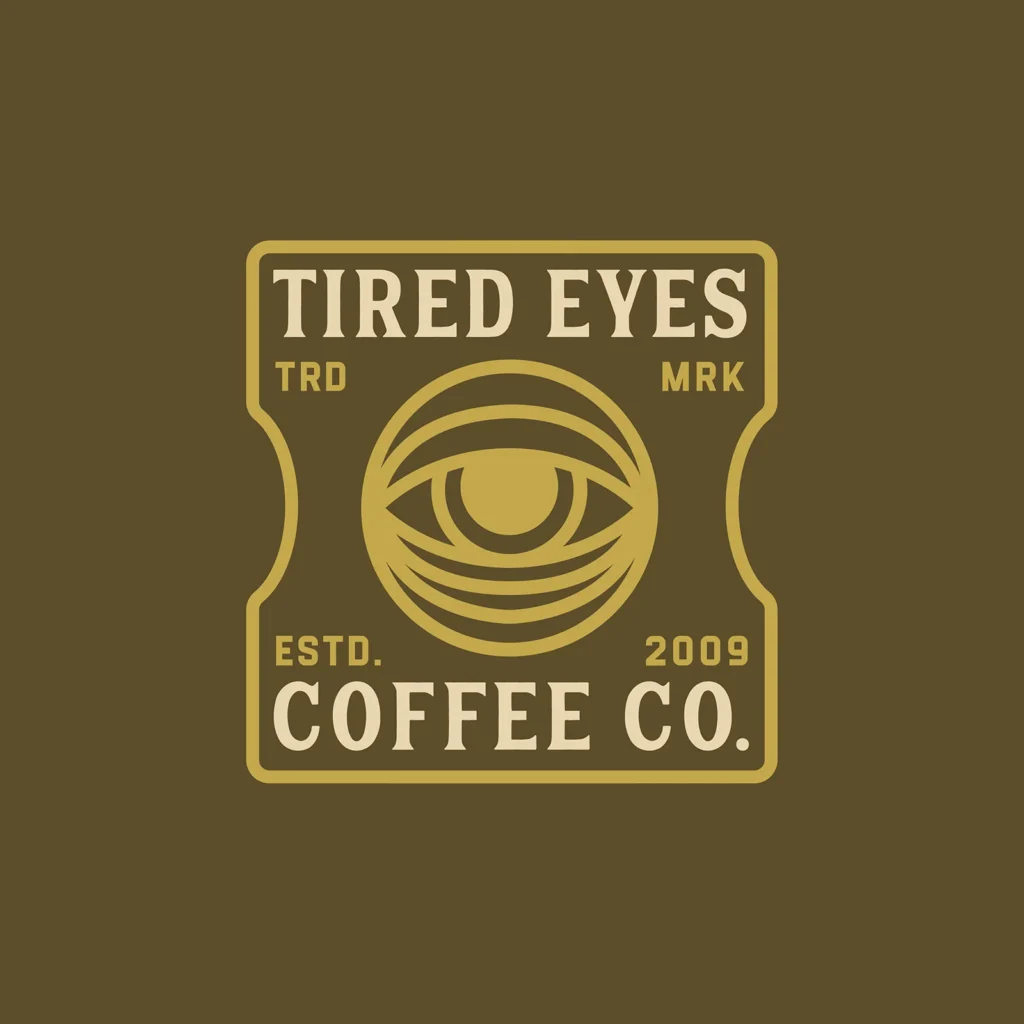
Late in 2021, I had the opportunity to work with one of my favorite record labels No Sleep Records on a logo suite for a new sub-branded for a coffee company with the same name.
Round 1
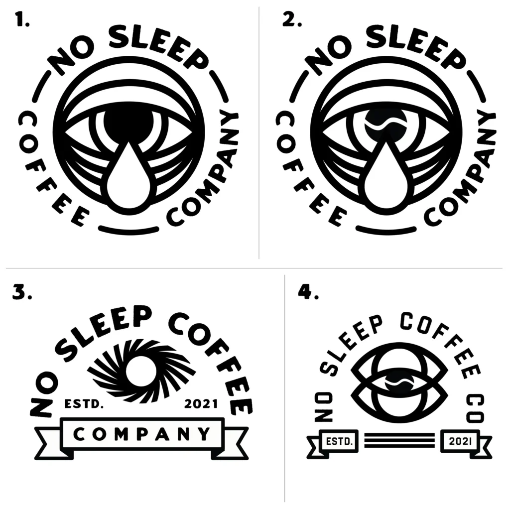
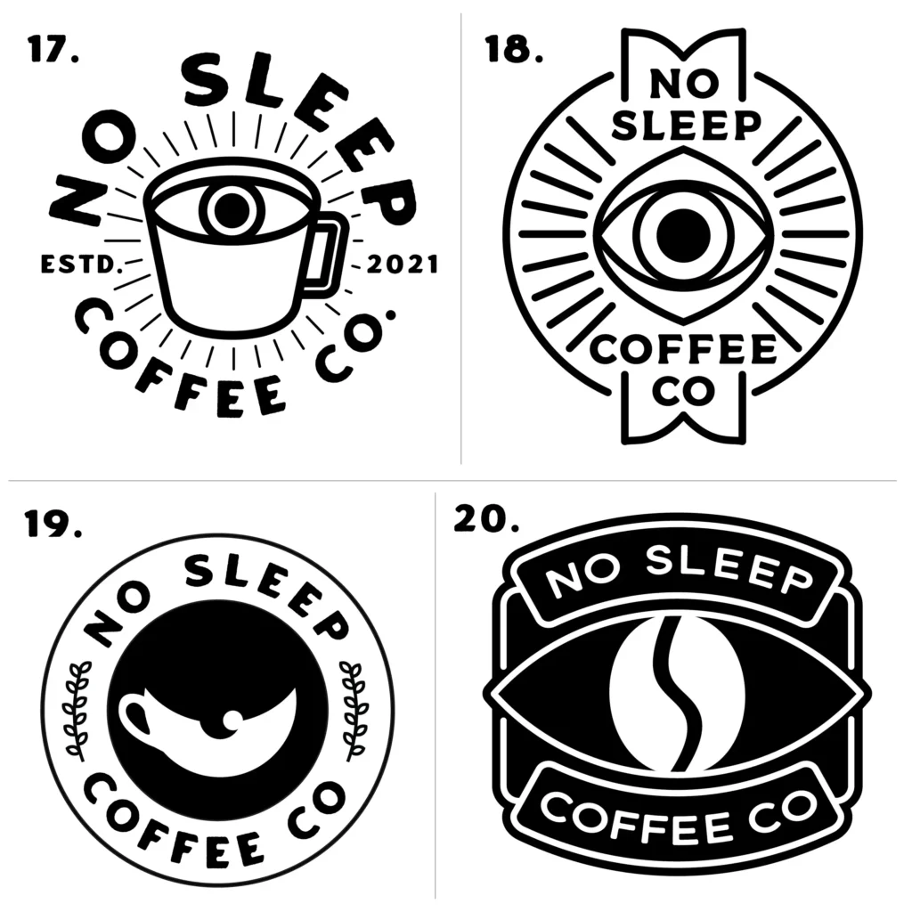
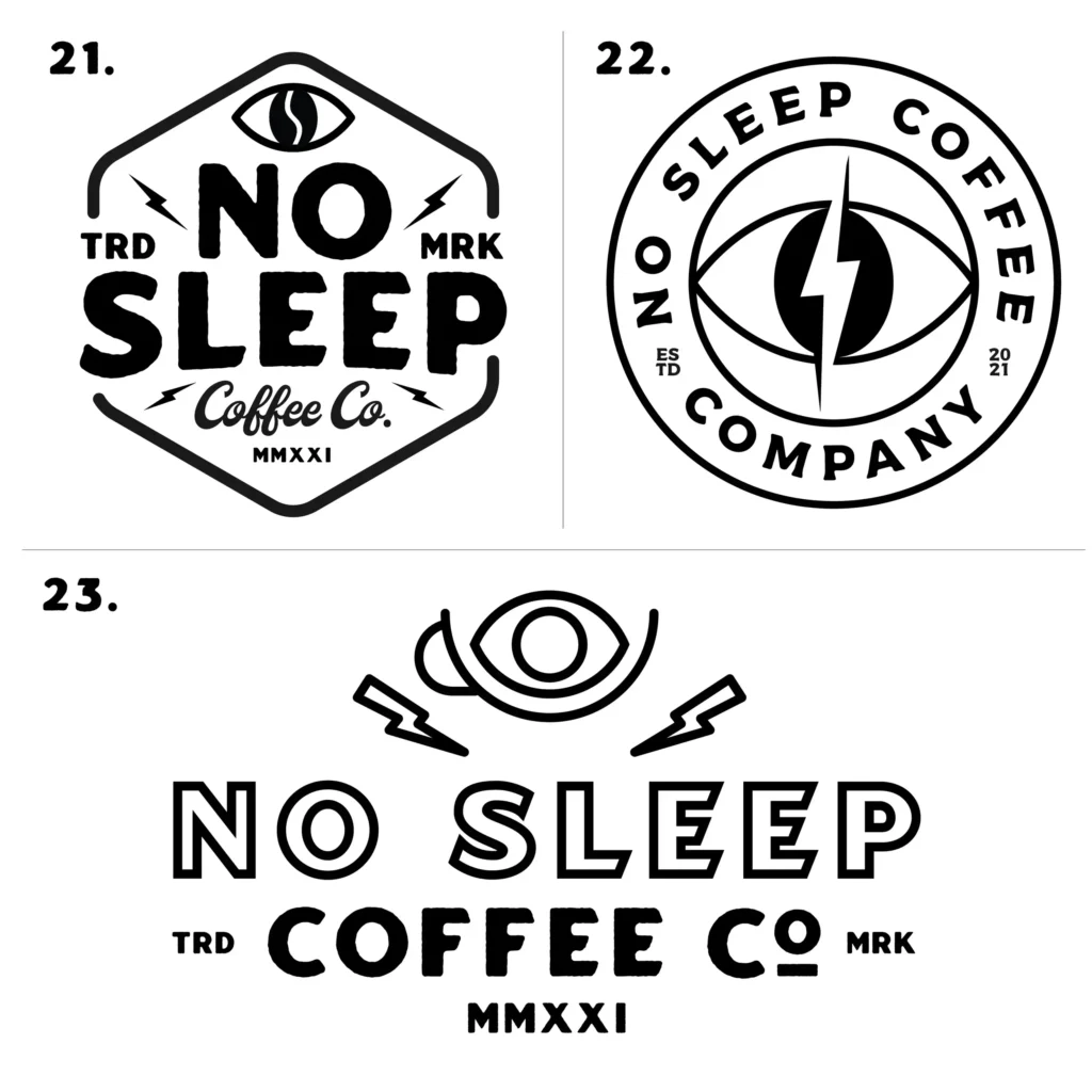
Probably one of the most extensive first rounds I’ve ever sent over. Took the clients brief and really ran with a ton of different ideas and concepts with the same overall look for all of the attempts here.
Round 2
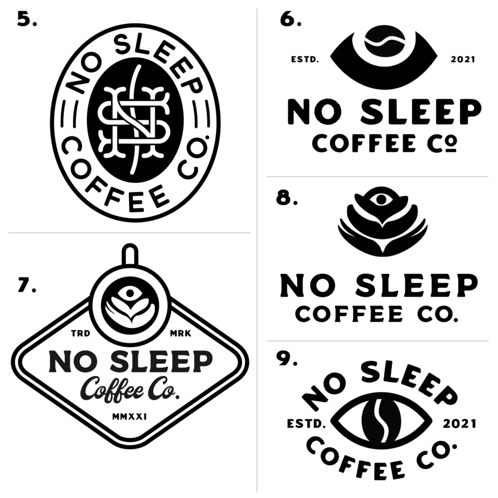
In the second round we tried a TON more things. Took some of the ideas from the first round and tweaked and improved on them and also tried some things that were the same overall feeling but brand new ideas.
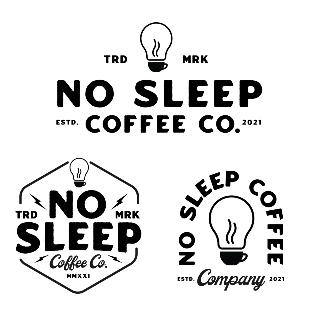
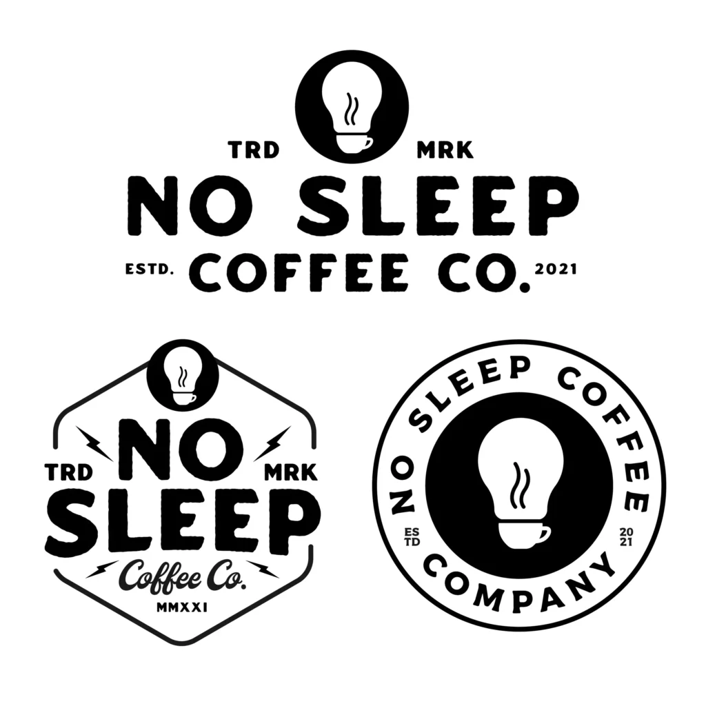
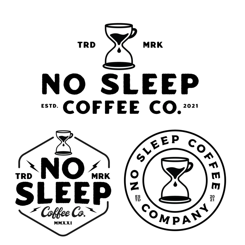
Round 3
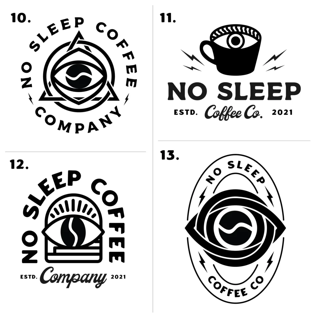
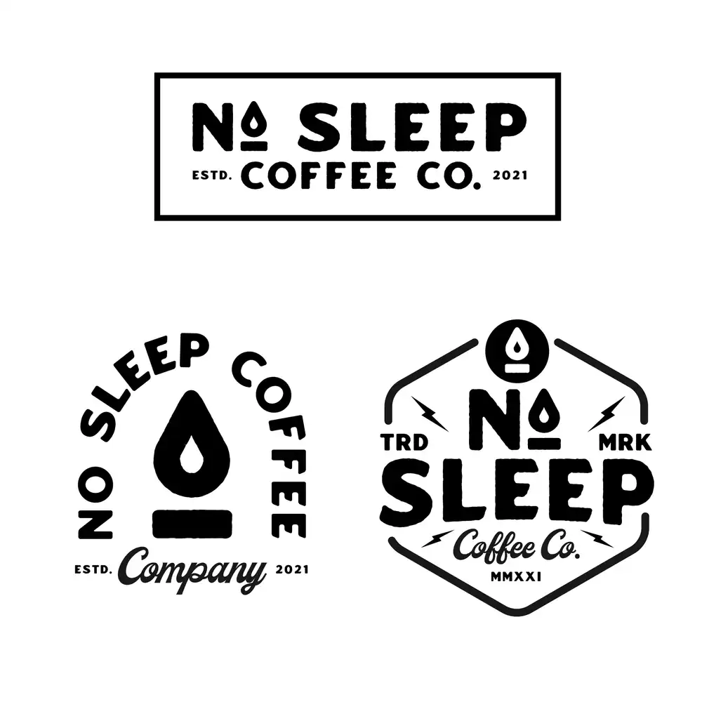
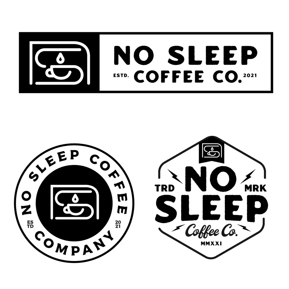
In round 3 we settled on the main icon and tried some different shapes and alts that the client ended up loving all of.
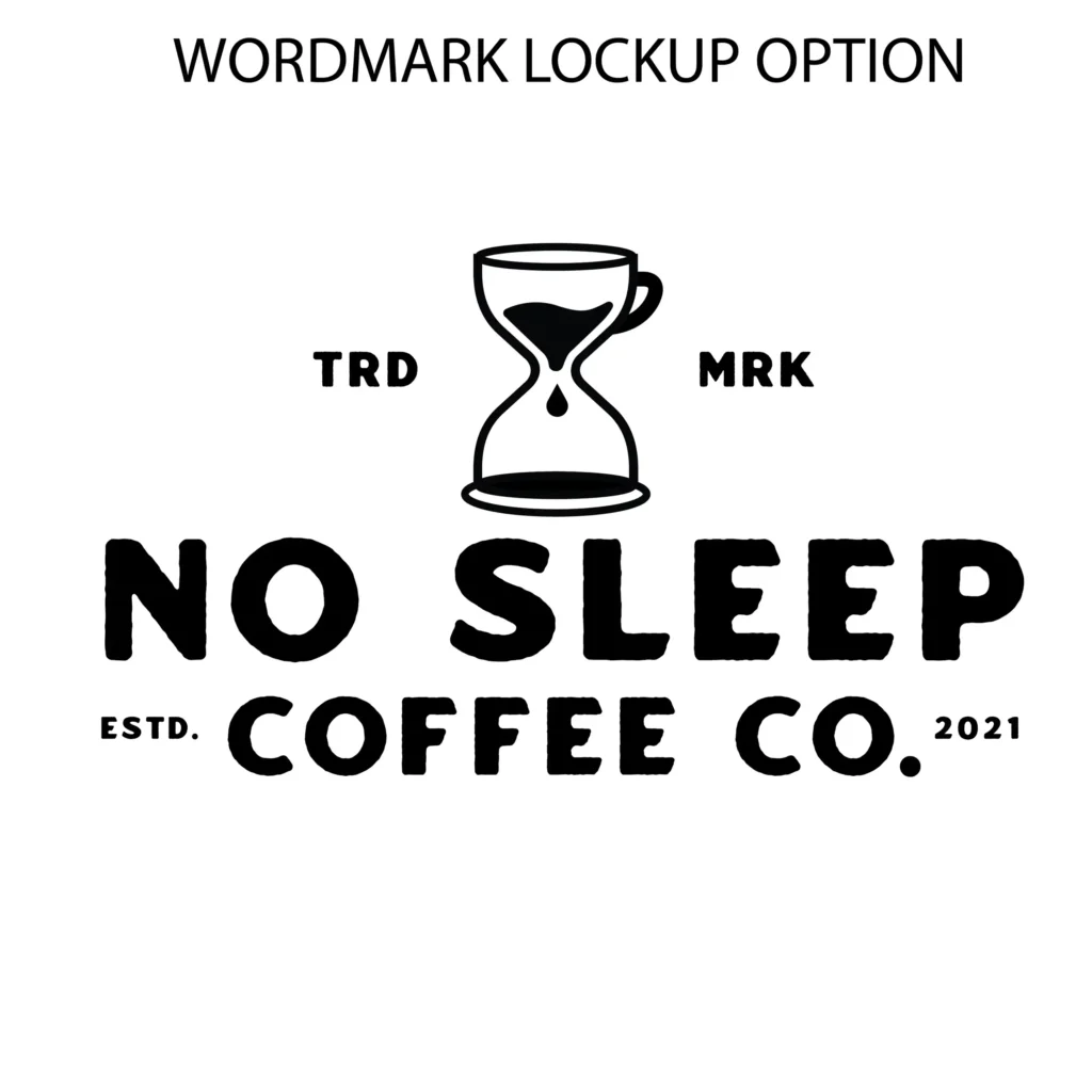
Final Logos
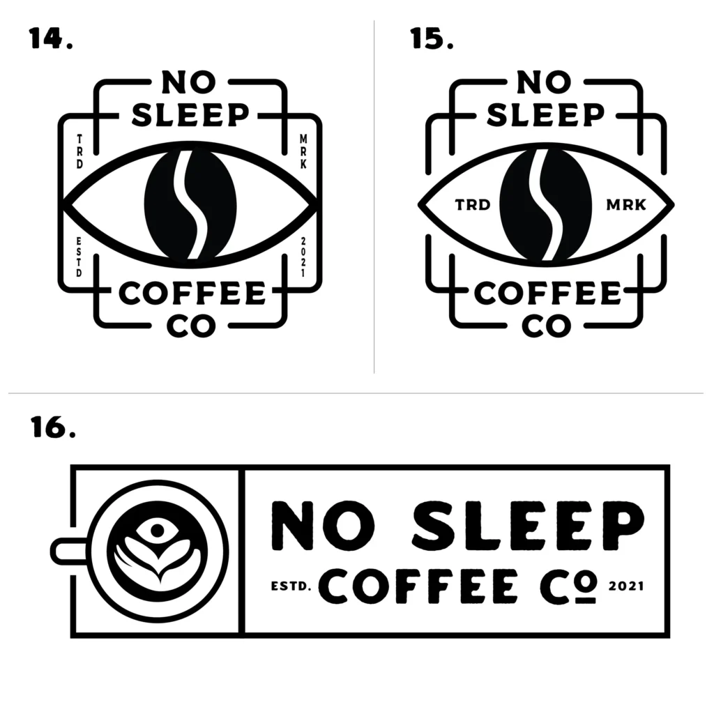
Turned all of the ideas from the final round into fully realized alternative marks and logos that can be used for a variety of different things.
